Basic HTML Version

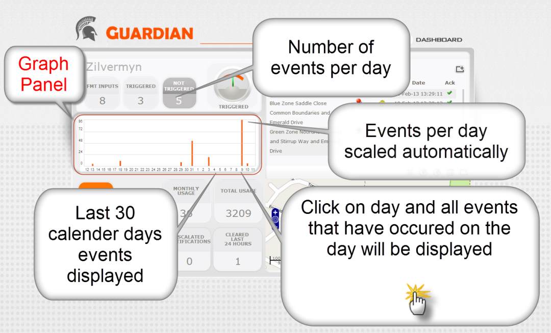
Dashboard : Graph
panel, provides an immediate view if any systems
in alarm.
Dashboard: Graph
In this section, the Dashboard displays a graph of the events over the last 30 days.
The graphs X axis automatically scales to provide the most detailed view.
The graph is a useful tool checking if there is a trend in the increase or decrease in
the number of events or a spike in events.
TIPS
1.
To check the details of events on a particular day, there is no need to use the
Search & Sort Function.
2. Left click on the date on the Y Axis and a list of all the events on that day will
be presented to you.
3.
You can then export the list of events to Excel using the export function as a
.CSV file
3.
A spike will indicate that something out of the ordinary is occurring. Customers
find this to be very useful for fire detection systems where fire alarms
keep occurring and management is not informed.

